_PROJECT
FORTNITE WORLD CUP BRANDING
_PROJECT
FORTNITE WORLD CUP BRANDING
_PROJECT
FORTNITE WORLD CUP BRANDING
_PROJECT
FORTNITE WORLD CUP BRANDING
_PROJECT
FORTNITE WORLD CUP BRANDING
_ABOUT:
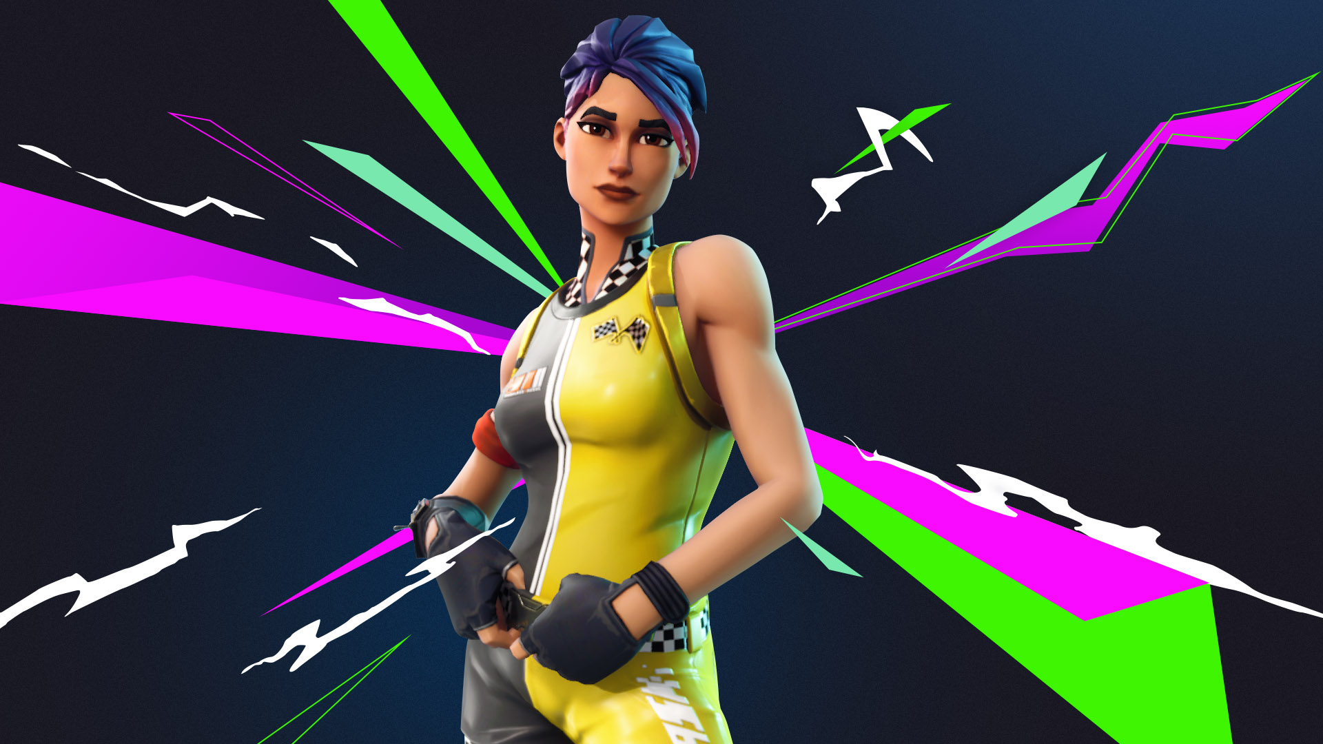
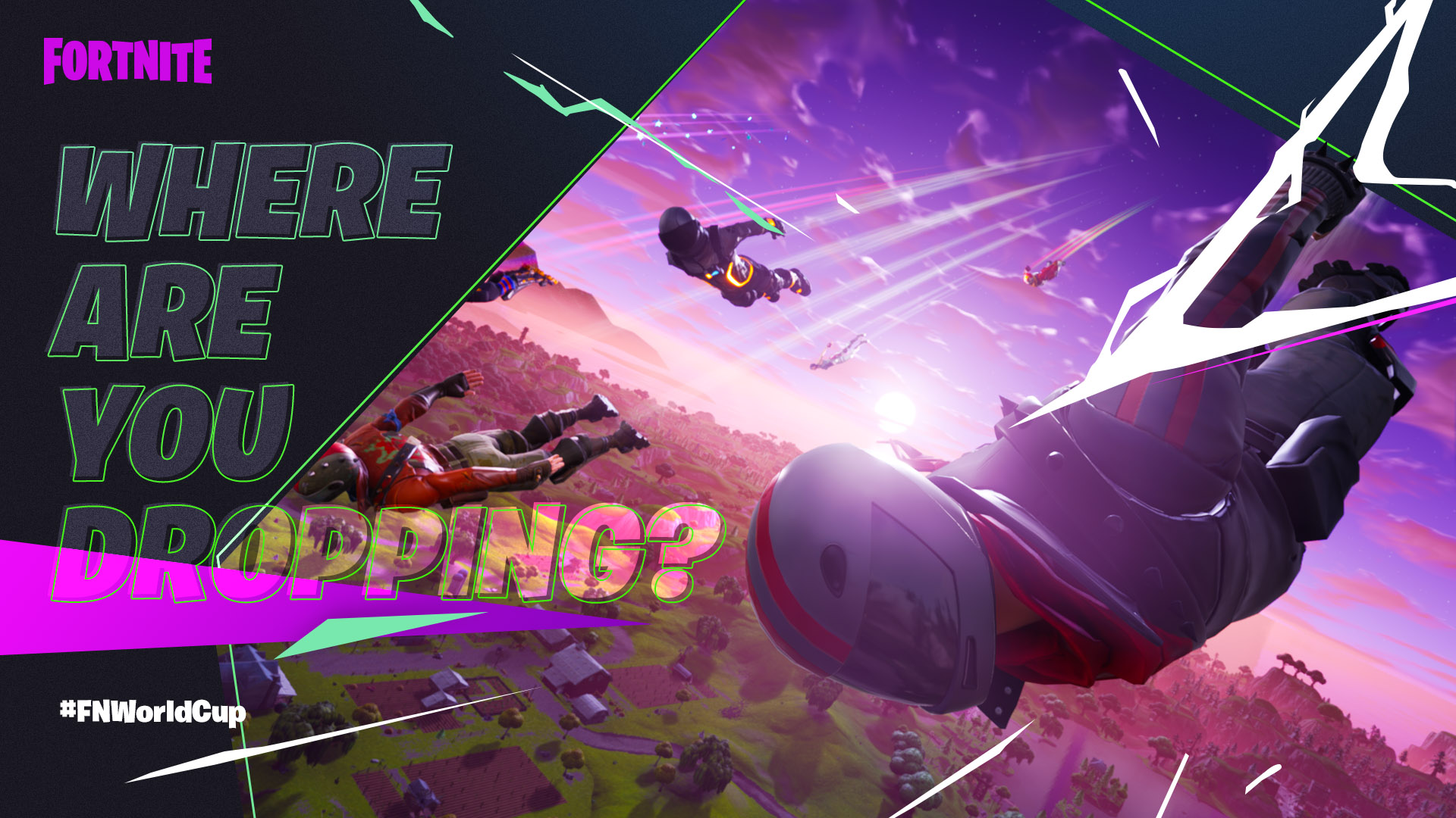
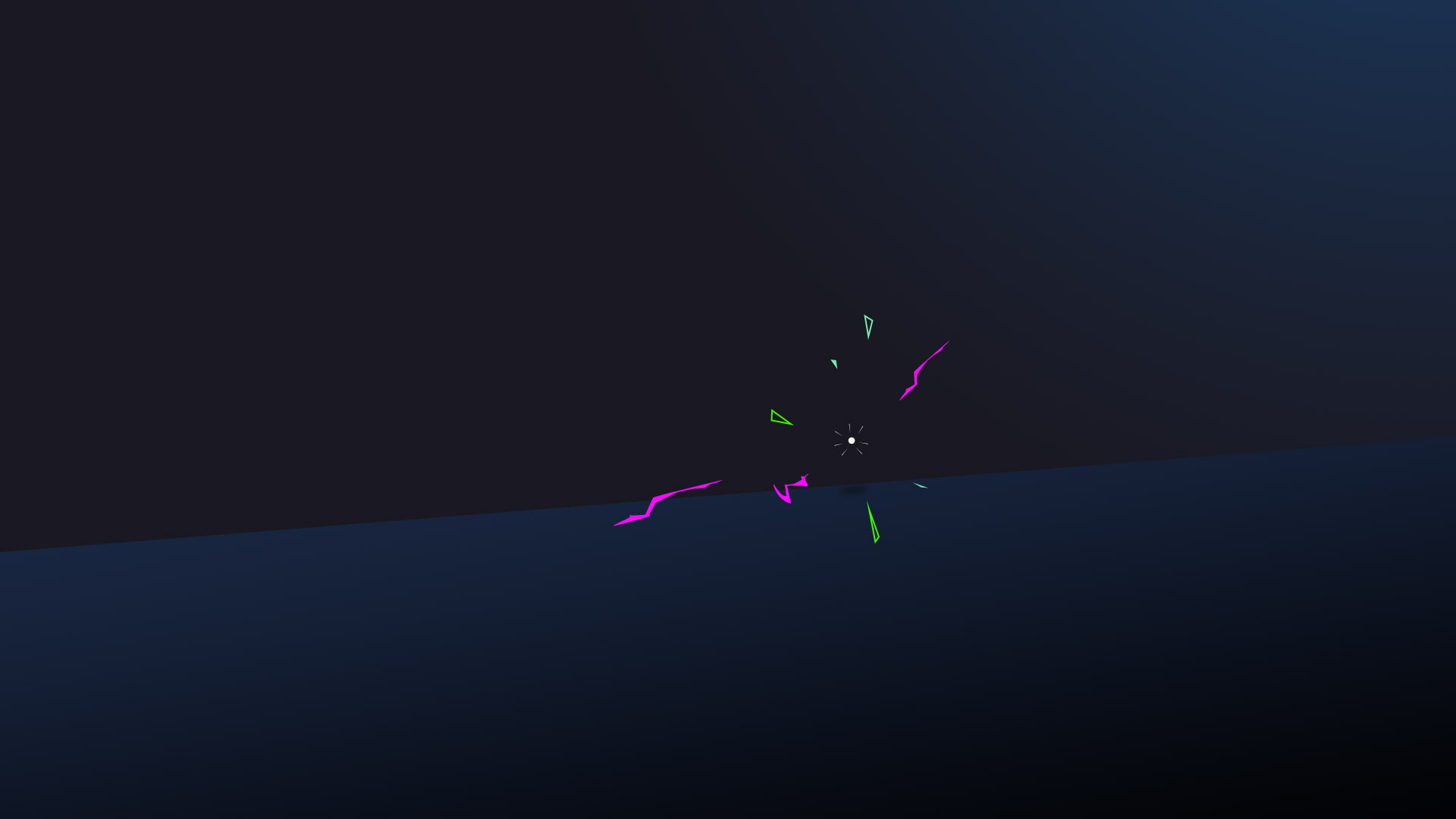
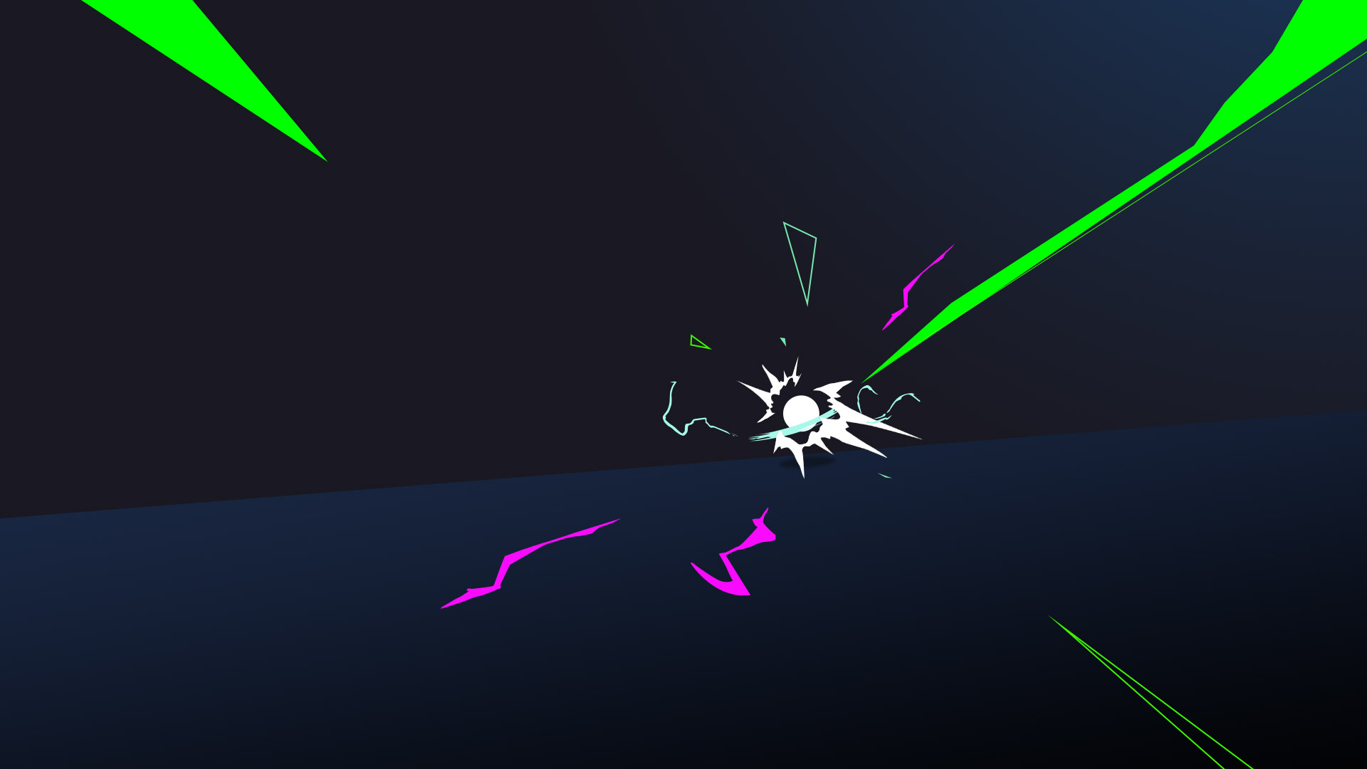
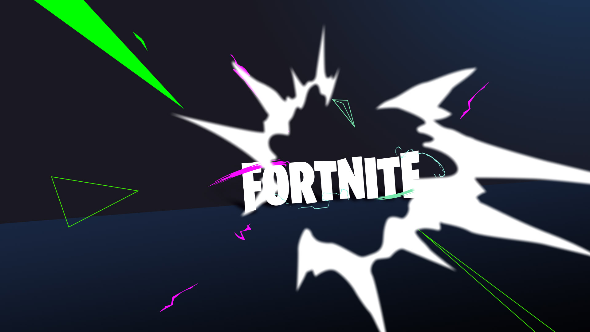
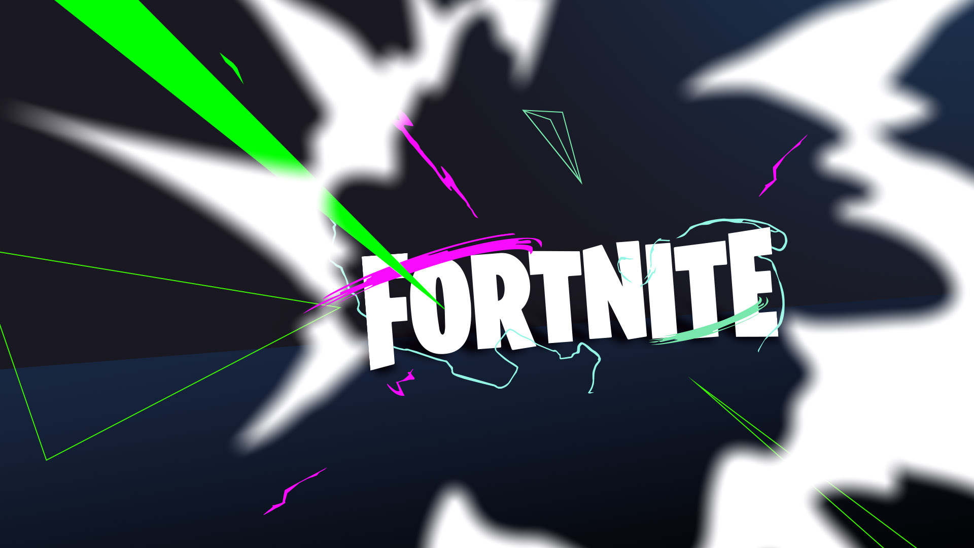
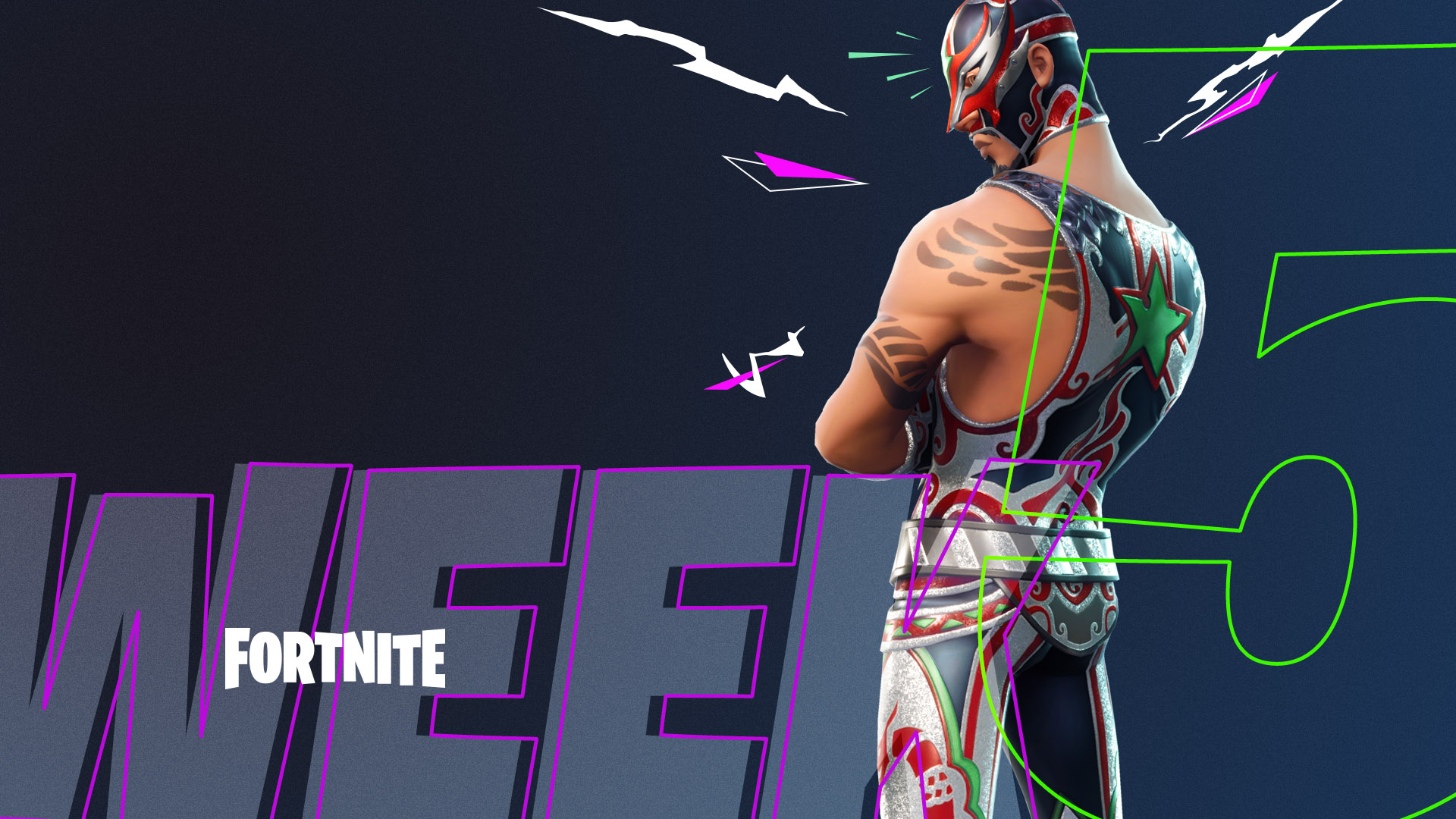
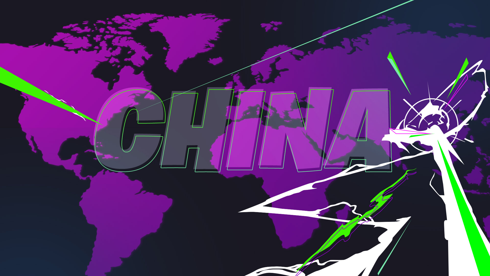
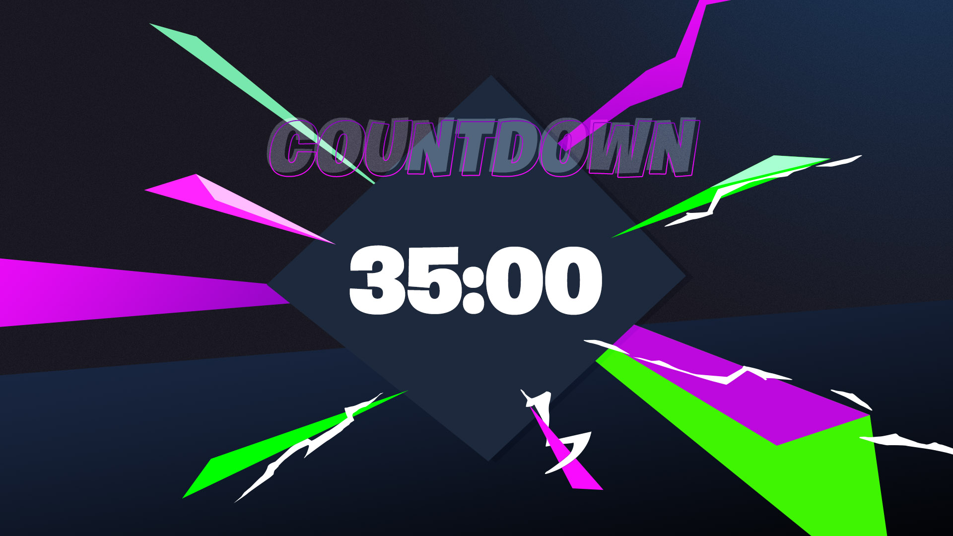
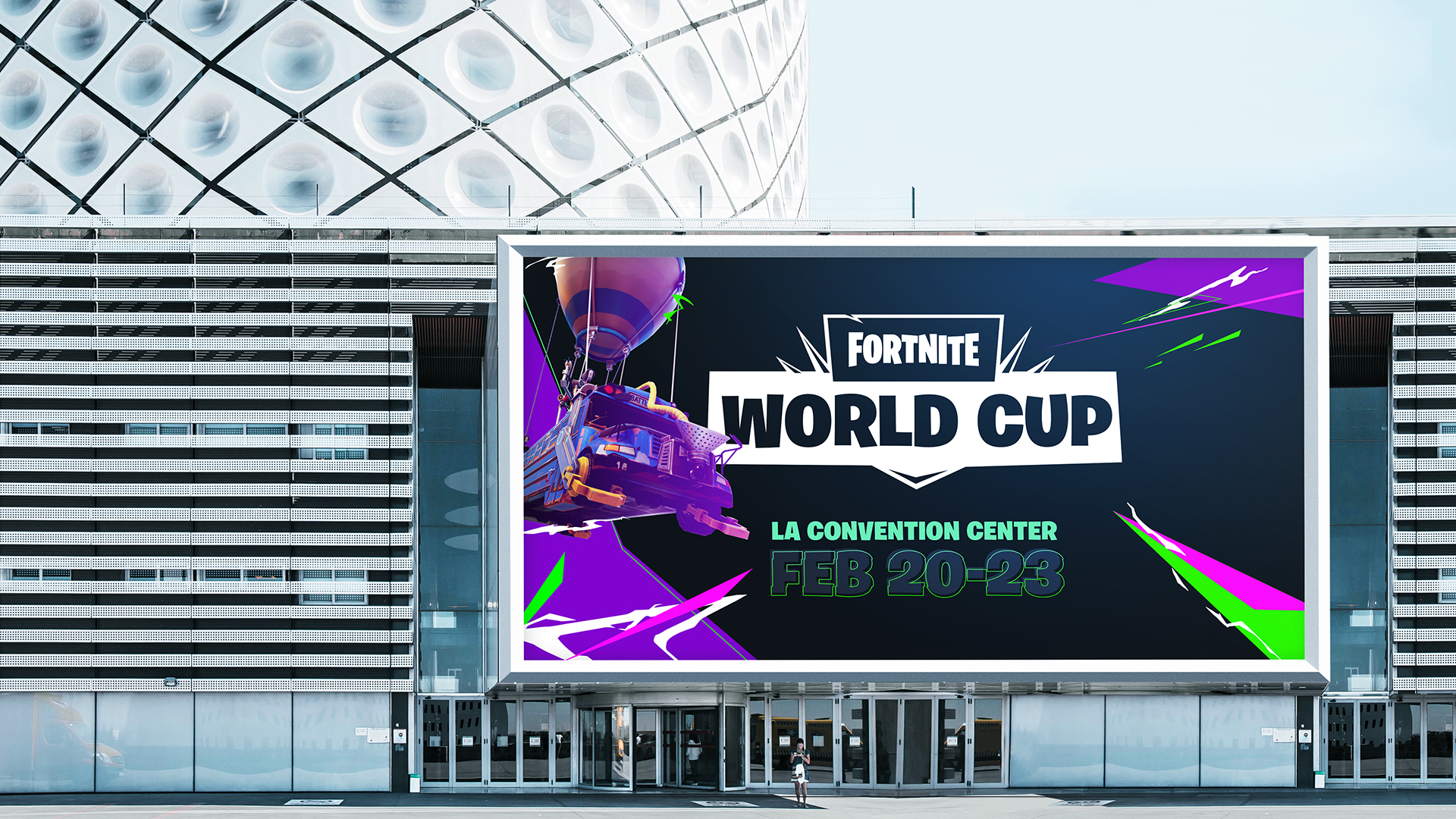
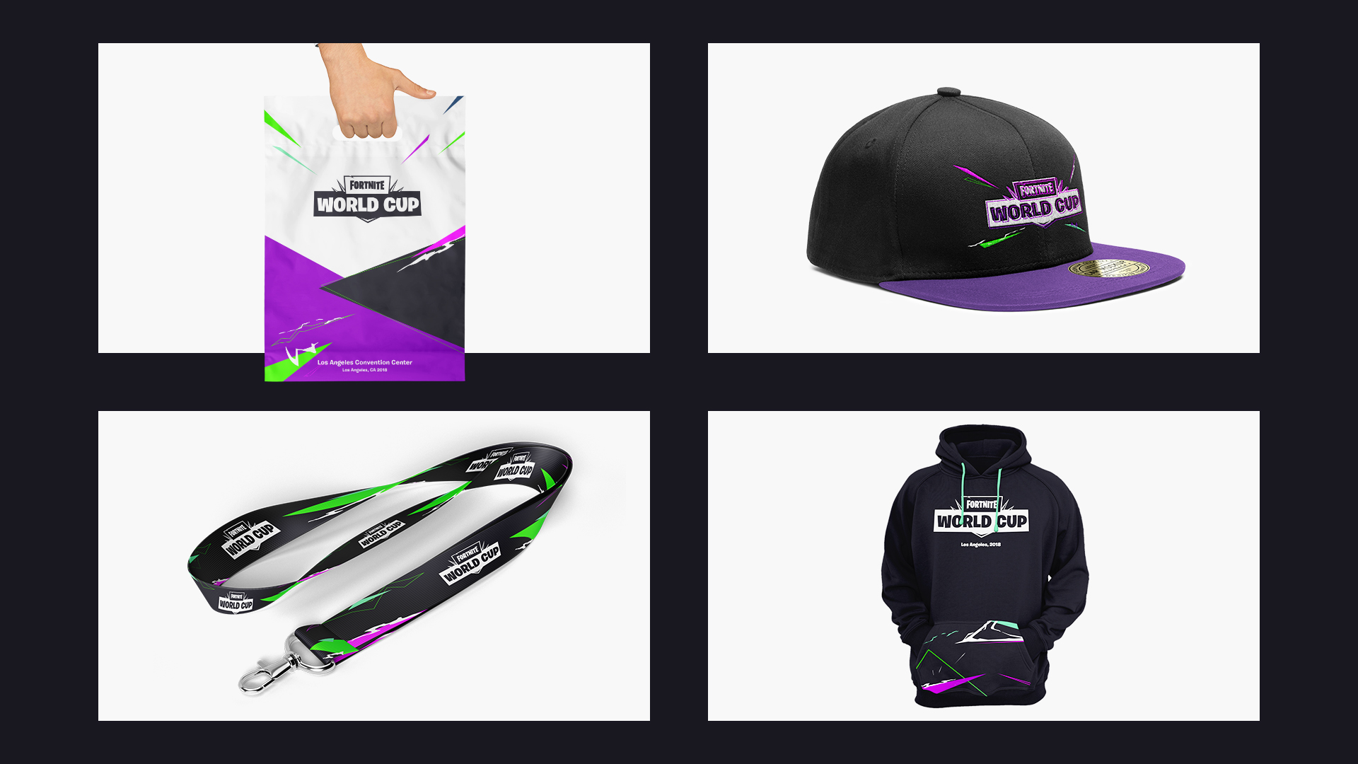
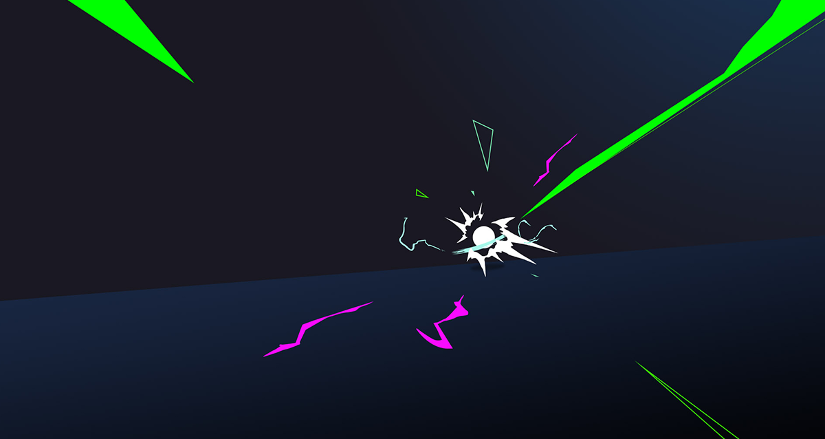
This was my initial pitch deck for the Fortnite World Cup branding. We decided early on that we didn't want Fortnite to have the typical esports branding that you see in other games. The Creative Director came up with four words that could be used to describe what the competitive brand for Fornite should be. They were competitive, potential, frenetic and inclusive. With that in mind, I came up with this design that incorporated some of the elements Fortnite was already using as well as adding new elements like the lighting bolt effects.
The neon colors on top of the darker background gave this look a unique style that set it apart from the normal Fortnite brand. Through some iteration, the style for the final branding uses a lot of the elements laid out in this concept but using a more vibrant color palette.
_
_TECH SPECS:
- 2018
- Graphic Design, Branding
- Adobe Illustrator / Photoshop
_